Libnamic Suite Builder is a block builder for Omeka S pages. This solution allows for the addition of a comprehensive block builder, configuration of various options, and embedding of new functionalities within the structure of Omeka pages. Its operation primarily focuses on two areas: the definition of the layout structure and the inclusion of blocks.
The layout structure follows a philosophy similar to modern web design, based on row and column structures. In this way, immediately after starting, the user is prompted to configure the page structure they wish to implement.
The inclusion of blocks allows you to complement the spaces created by the page layout. To do this, you must choose one from the different block types and adjust both the content and the configuration of each. Once these steps are completed, the result can be viewed on the public-facing side of Omeka. By adjusting the configuration parameters, you can modify the behavior or appearance of the various blocks. For example, you can change the text size of a button or the size of a text box.
To ensure the correct display of various modules, basic knowledge of CSS units is required. Otherwise, anomalous or overly large values will result in incorrect display. Therefore, it is recommended that users exercise caution when configuring certain parameters.
1. Differences from the Omeka S Interface
Page Design
Omeka offers a view where blocks are stacked vertically to form the page.
Libnamic Suite Builder allows for content distribution across sections and rows, providing multiple column templates and a Grid layout format for the content.
Content Blocks
Omeka provides 16 predefined blocks that can be added to pages, covering basic needs for organizing and presenting information.
Libnamic Suite Builder offers over 30 customizable blocks, providing more creative possibilities. Additionally, some of these blocks are integrated with specific Omeka modules.
Block Customization
The content block options in the Omeka interface are quite simplified.
Each content block in Libnamic Suite Builder comes with a variety of parameters for customization, including options for including CSS code.
2. Interface and Concepts
1. How to Load the Builder:
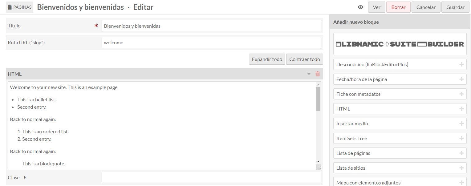
After the initial setup, you can start building pages with Libnamic Suite Builder. To do this, select the "Pages" option and add a new page. Once added, you can begin constructing your page. After creating the page, various options will appear in the side menu for adding new blocks; you should select Libnamic Suite Builder. Once added, you can start building your page.
2. Basic Concepts of the Builder:
In the main template, you will find a series of options that allow for editing, exporting, and importing layouts.
These general options are:

-Options: Allows you to change the information of the page you have created (Title, URL path, etc.).
-Undo: Undoes the last block addition made.
-Redo: Redoes the last changes made.
-Copy: Copies the page template to the browser's clipboard.
-Paste: Allows you to paste a previously copied template.
-Export: Exports the template as a .json file, which can be saved to the file system.
-Import: Allows you to import a file in JSON format.
-Delete: Deletes all content created with the builder.
Each time you open the settings of a component, a sidebar will appear with all the content, layout, and advanced settings available for that component.
In the upper left corner, you will see the name of the builder element you are working on. This could be a section, a row, a block, a page setting, etc. If you ever get confused about which component you are editing, check here to find out.
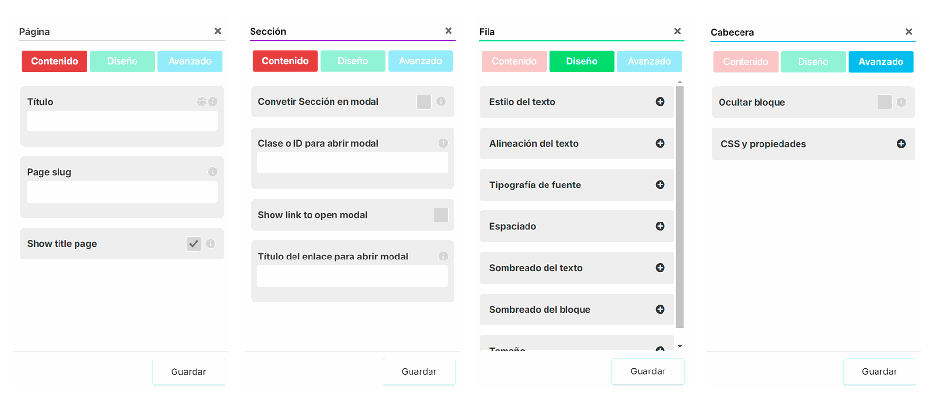
Each block template has a series of parameters to configure and options that allow for customization and correct display in the public area. These options are categorized into three main blocks:
This section covers options related to content. For example, in a text block, you can complete the message body, title, link, etc.
Each component will have a series of specific fields that allow for its customization.
This section includes advanced options for controlling the display and layout of elements, such as "Hide Block," "CSS and Properties," etc.
Relative to the component's styles, such as text color, size, spacing, etc.
Once the various properties are adjusted, the user must save both in the components and on the Omeka page. This step is crucial, as failing to save changes will result in losing the information entered in the various configuration forms.

Omeka
Always located in the upper right corner of the page.
Libnamic Suite Builder
Always located in the lower right corner of the sidebar.
3. Components
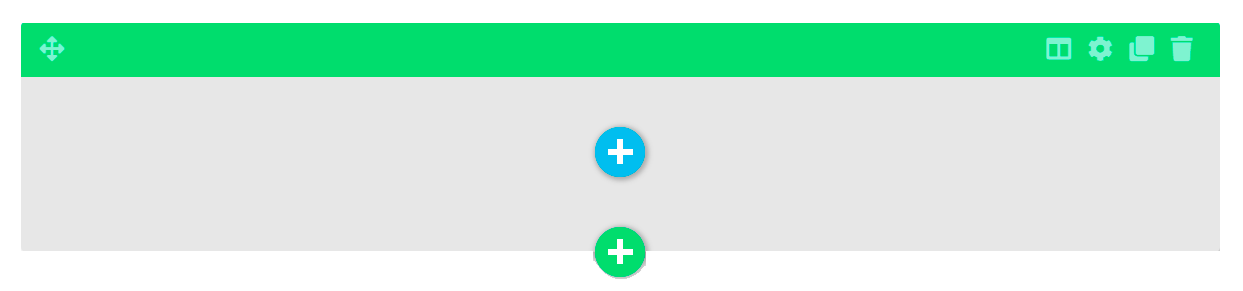
The main basic components of Libnamic Suite Builder are sections, rows, and blocks. Sections contain rows, which contain blocks. All components have similar options: Move, Settings, Duplicate, and Delete.

3.1. Sections

Sections are the primary containers used to structure your page. You can add different rows and blocks within sections to organize the content.
3.2. Rows
Rows are nested within sections and can contain a variety of column layouts and grid formats, helping to structure the content.
As mentioned earlier, the options for the main components are the same, except for Rows, which include template settings where you can change the column layout or switch to Grid format at any time.
Styles:
Grid: Allows you to add and distribute blocks in a more customized manner by dividing a row into areas or regions, where you can define the relationship in terms of size, position, and layering of the blocks.
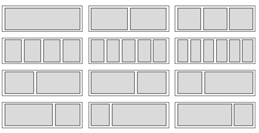
Columns: Rows are different column layouts that can be placed within sections. Rows have various settings accessible by clicking the settings icon in the upper left corner of the row.
3.3. Blocks

Content blocks are used to organize and present different types of information in a structured manner on a page. They can contain anything from simple text to more complex elements such as images, videos, or lists.
After choosing the row and column layout, the user must select the type of block to place in each of the assigned spaces. If none is chosen, the space will appear empty by default but will retain its proportions and dimensions. This feature can be useful for creating special structures or separating content.
Each block has its own Content, Style, and Advanced settings.